1) Stand Out From Your Competition
Although this seems an obvious step, its not always obvious at how to achieve it. You absolutely want to know what your competition is doing – but do NOT copy them. If your competitor doesn’t display their pricing, provide yours. Is your competitor offering a special? Offer a better one! Put yourself in the best possible position, above your competition.
2) Easy To Read
You want your flyer to be insanely easy to read. So just remember – make it BIG, make it BOLD, and keep it simple. Include big headlines with a clear, powerful, and short message. You do not want your potential customer to put the flyer down before they get the message. Less is more in this case. Bonus points if the font is big enough to be read without the assistance of reading glasses! This is important when targeting those over the age of 45, they will be sure to contact you over your competitor if they are sent searching for their glasses.
3) Target Your Audience
You must know what your customers want/are looking for, before you begin the design process. Get to know your customer demographic, who are they? Where do they live? What is their age group? What is their income? Each of these factors plays a role into what your customer is looking for. What need they are looking to fill or problem they need to solve. Know your audience.
4) Call to Action
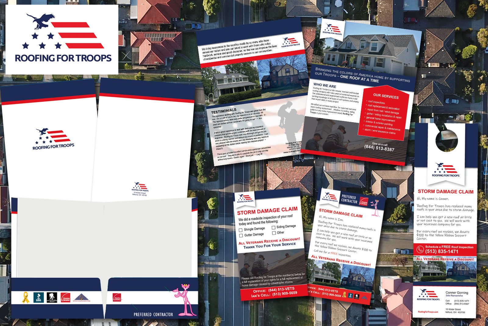
Tell them what to do. Do you want them to schedule and appointment or visit your website? Then tell them to! Unless you specifically point out a call to action on your flyer, you will be disappointed in the response you get from your marketing piece. Help your customers understand what they need to do and show them how to do it.


